
A retrospective on the use of data in the school closure debate
This edition of The Civic Pulse I want to talk about something close to my heart – the debate about expertise, empiricism, and their role in public decision making. I’ll explore this topic through the public debate about school closures and COVID-19 because it serves as an excellent example of our current capacity (or lack thereof) to integrate data into fast-moving and hugely consequential policy questions. And, it’s a so-called wicked problem that most people have an opinion on. I think how it has unfolded highlights an important challenge for all of us as scholars, funders, publishers, and consumers of information – how do we evaluate expertise?
In this issue you’ll find:
- An essay on decisiveness, data, and who gets to be empirical
- What we’re reading this snowy winter
As always, thank you for reading. On to this month’s main event.
A retrospective on the use of data in the school closure debate
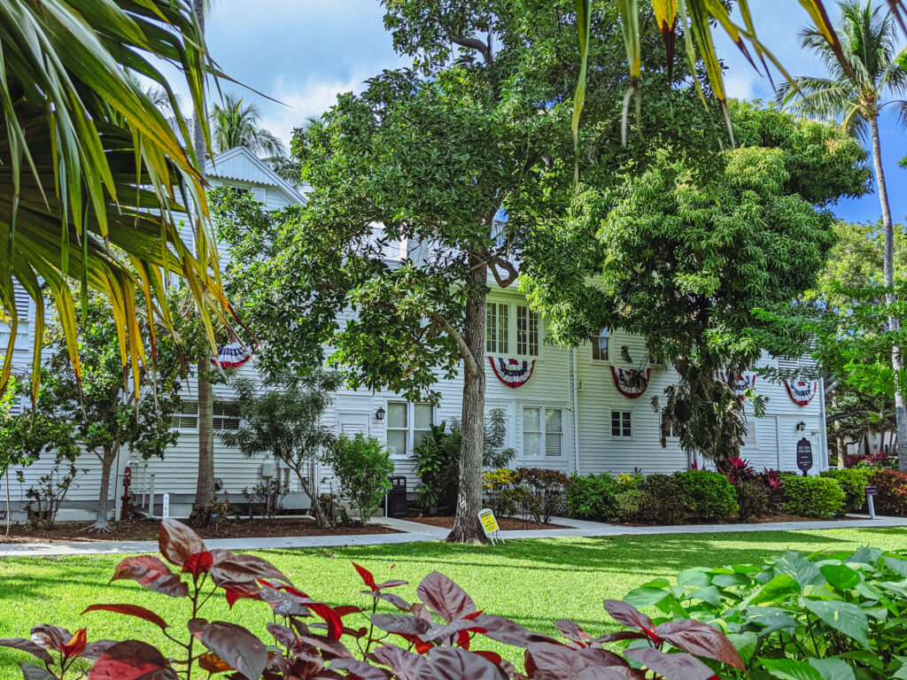
I recently had the chance to visit Harry Truman’s Little White House in Key West, Florida, and see where he spent about 10% of his presidency. Truman, of course, is famous among social scientists for having said:
Give me a one-handed economist. All my economists say ‘on the one hand…’, then ‘but on the other…
Harry Truman (Though whether he said it or not is an interesting read in and of itself, as it so often is with these types of quips.)

The term “one-handed economist” was actually part of a widely circulating turn of phrase in the period where “one-armed” or “one-handed” referred to someone who was decisive and was applied to all kinds of members of the professional class – lawyers, accountants, and even presidents themselves. In an age of great uncertainty and economic, geopolitical, and domestic crises there was a demand for decisiveness.
Sound familiar?
It struck me, as the school closure, isolation timeline, and lockdown debate flared up with omicron, that we are awash with one-handed economists and I’m not sure President Truman would find it of much comfort.
I don’t want to debate the merits of decisiveness itself, but I do want to unpack how we evaluate the sources of authority for the voices that get to be decisive in society today. Tressie McMillan Cottom’s recent essay on the expectation that we all become “experts” and why that is not good – hell, it’s exhausting – is a good starting point.
From ugly leggings to a global financial crisis and back, all of these examples have the same social DNA: failing institutions, aspirational people and nefarious actors willing to exploit both….
It is no wonder that so many of us think that we can parse vaccine trial data, compare personal protective equipment, write school policy and call career scientists idiots on Facebook. We are know-it-alls because we are responsible for knowing everything. And God forbid we should not know something and get scammed. If that happens, it is definitely our fault.
InInstitutional failures, including our sometimes earned, and sometimes unearned, mistrust for others to be experts on our behalf, open the door for new actors with hidden agendas, one of which is a very old type (the oracle) wrapped up in fancy new clothes (empirical data analysis).
My objection is not with public figures making recommendations but with the claims of authority these new oracles derive from data. The modern version of the one-handed economist is probably most popularly represented in the contemporary hot-takeism of Nate Silver, something covered far better than I could in the best couple paragraphs of writing I have read in 2022 from Lyz Lenz’s Men Yell At Me newsletter:
The problem is, we have a society that cleaves to an idea that it is possible to have a dispassionate and purely rational view of anything. We foolishly believe that if only we could look at numbers, charts, graphs, we could rid ourselves of all this pesky other business like sexism, racism, misogyny, homophobia, transphobia, fat phobia… But those numbers, those questions, those polls, those charts are compiled by flawed human beings with biases and prejudices… this analysis is actually entirely ruled by passion and emotion that is unchecked, unfiltered, welded [sic] as a cudgel and hides behind the veneer of dispassionate analysis…
[T]he world is a mess. And it’s so hard. Anyone providing easy answers is selling you snake oil dressed up in the cheap language of scientific analysis.
But, while it is fun to dunk on Nate Silver, it’s important to see this as part of a broader problem – the problem of the data aesthetic used as a shortcut to authority. Which brings us to school closures, COVID, and Dr. Emily Oster, an economist at Brown University.
Dr. Oster is a bestselling author and many people seem to find her recommendations useful for a range of topics far afield from economics (pregnancy, parenting, childcare, education, etc.). Dr. Oster’s brand, if you will, is making recommendations for her audience based on objective clear-headed analysis of the facts.
Oster has published prominent op-eds weighing in on debates about school closures, school masking, and the risks of COVID. Much of this comes from a research effort Dr. Oster leads called “COVID Explained” which has this tagline:
COVID-19 is confusing. We are here with facts about the virus. How does it spread? How is it treated? Who does it affect most? Unbiased information to help you make good decisions.
If you read The Civic Pulse, that tagline likely sounds appealing to you – yes, I want facts and I want to make good decisions – sign me up! But, how do we distinguish “clear-headed analysis of the facts” from the data aesthetic, dressing up easy answers in “the cheap language of scientific analysis”? Well, a good place to start is to examine the evidence supporting those facts, and then look at who or what might be missing from the presentation.
Fortunately, Rachel Cohen published a piece in The American Prospect in fall 2020 [wow, that was a long time ago] that checked the source of many of the “facts” that were supporting Oster’s op-eds and that were being circulated to news outlets like The Washington Post, The New York Times, and The Atlantic.
Cohen’s article highlights one example op-ed with the headline “School Infection Rates Are Low Even in Areas With High COVID-19 Rates, According to Data on 550,000 US Students.” This example shows how a headline can be simultaneously accurate… and misleading. In the data on 550,000 students the infection rate reported is low. That is a fact. But implied in the headline, and the op-ed, is that we can generalize from this population to the broader U.S. (otherwise, why write the op-ed?). And it is in this slippery space between a true fact and broad conclusion that the aesthetic of data grants power to what is otherwise just another hot take.
I’ll let Cohen’s reporting take it from here:
Here are some additional facts about the COVID-19 School Response Dashboard dataset, as it existed on October 25 [2020]. There were 1,322 schools voluntarily reporting data, or about 1 percent of all K-12 schools in the country. It did not say how many school districts were reporting, though Oster told me last week they currently have “about 150.” There are 13,500 school districts across the United States.
A more detailed look brought its glaring gaps into sharper relief. There was not a single urban traditional public school reporting data across 27 states in her dataset, including from Florida, Texas, New York, Minnesota, Arkansas, and Mississippi. Some states, like Colorado, Kansas, Ohio, and Alabama, had just one urban traditional public school reporting data. Oster told me they’re working to make their dataset “more representative” and conceded that those who opted to voluntarily report tended to be a “higher-income sample, and more suburban.”
(emphasis original, and heartily endorsed by me as well)
One imagines that, if a student in one of Dr. Oster’s courses at Brown University used a non-random, voluntary, survey sample of less than 1% of the population to make a broad conclusion with wide-reaching policy impacts, they’d receive a polite note reminding them to review their textbook.
But it’s not just about the sample or the data collection (though a trained economist knows better), it’s about the context given to the facts; what is and is not said with the authority won through the combination of the academic credential and data collection. The tool initially published by Dr. Oster – and, as these things go, the version that got almost all of the attention – did not include any way to disaggregate data on those 500,000 students by race, ethnicity, or school Title I status – something practically as natural to a researcher like Oster as breathing air. Again, from Cohen:
Oster’s story also said nothing about race. “It’s myopic. The piece of analysis that’s missing both in her Atlantic article and the dashboard is that Black and brown communities have been disproportionately hit hard by COVID,” said Constance Lindsay, an education policy researcher at UNC. Black and Latino communities have been contracting COVID and dying of it at higher rates, and while Oster targets Chicago, Los Angeles, and Houston specifically for not reopening schools, there was no mention that these cities have higher concentrations of Black and Latino families…
Lindsay adds that she’d feel a little better if Oster’s database broke out information about Title I schools and the percentage of Black and brown students at each school. Oster told me “that’s something we can certainly do, and I think those kinds of covariates are on our to-do list.”
So what is going on here? Dr. Oster and team filled a gap left by institutions that could not keep up, but they staked their claim of legitimacy on the data they had gathered – not on the theory or context of the collection. The theory is left implicit, and all too often the people doing the research team and reporting on that research have the same theory.
But the world is complicated, as Andrew Gelman, one of the best reads on quantitative analysis in the social sciences, recently discussed:
The real world is complicated. Take a generally true theory, gather lots of data, and you’ll see some patterns that appear to contradict the theory. Or, take a completely wrong theory, gather lots of data, and you’ll see some patterns that are consistent with the theory. That’s just the way things go… Statistics has prestige, so it makes sense that people will try to use statistics as a convincer.
Think for a moment. Would a Black-led research team have de-prioritized looking at the data by race? Would someone who lived in a multi-generational household, whose child had severe asthma, or whose child attended public school with predominantly students of color* collected, analyzed, and reported on data in the same way? (We don’t know which, if any of these apply to Dr. Oster, only that her children attend private school as did she.)
Again, the problem isn’t the study – the problem is that this work is leaning on the credentials of the scientific method without subjecting itself to the process of scientific inquiry and peer review. And, in so doing, it is taking the oxygen out of the room for alternative voices, it is shaping policy with prominent op-eds, and it is entrenching a specific set of implicit theories through the use of data as evidence. Science is an act of consensus, not fiat. The data aesthetic as it is deployed here is an attempt to take a shortcut past the messy process of accumulating scientific evidence in a race to make a point.
Unfortunately, we are the losers in all this. When researchers step outside the consensus-building process of scientific peer review, we are forced to step in. To paraphrase Dr. Tressie McMillan Cottom, the peer review has been outsourced to us, which is, unfortunately, exhausting.
But when and where we can, we have to demand better standards of evidence before granting researchers authority on a particular topic, no matter their credentials. And we should demand our public discourse look around a little further than the nearest Ivy League economics department to find expert consensus on important topics.
As a data analyst I take this stuff to heart – good data work is careful, deliberate, and subjective work that requires a lot of deliberation and consultation. I think a good start would be to pop up this quote from Deborah Stone, from her book Counting, every time a quantitative researcher opens Excel, Stata, or R:
Above all, we shouldn’t use numbers to cover over our deep conflicts and ethical dilemmas.
Deborah Stone, Counting
Good empirical science doesn’t cover these things over – it states these conflicts and notes its limitations up front. In other words, “on the one hand… but on the other hand…”
What we’re reading and thinking about:
White scholars colonizing health disparities research – STAT News
Continuing on the theme of this newsletter about who gets to be experts – this is a must-read story about what is happening in the field of health disparities research (and I imagine is also happening in research on equity and racial disparities in many other fields). Here’s a good quote:
But a STAT investigation shows a disturbing trend: a gold rush mentality where researchers with little or no background or training in health equity research, often white and already well-funded, are rushing in to scoop up grants and publish papers. STAT has documented dozens of cases where white researchers are building on the work of, or picking the brains of, Black and brown researchers without citing them or offering to include them on grants or as co-authors.
Lots of people are putting out tools to understand the 2020 Census, but I wanted to give a particular shoutout to the folks at Big Local News. I’m a big fan of their whole approach – providing data analysis and story development tools to local journalists through collaboration and open analysis. It’s no surprise that their Census Mapper delivers.
Congressional Trading in 2021 – Unusual Whales
Looking at a different kind of data from a different direction – I cannot stop staring at how well members of the U.S. House and Senate have done investing in 2021 as visualized in this report by Unusual Whales.
It’s not exactly reading, but I wanted to give a special shoutout to the new ABC show “Abbott Elementary” – in a TV lineup full of cops, doctors, and even cop doctors (or doctor cops?), it’s good to see teachers making their way to on-screen representation.
It’s a funny, charming, and kind-hearted show about a public elementary school in Philadelphia — two thumbs up.
Finally, we’ve been reading a lot about water infrastructure lately as we are gearing up a #rescuetherescuefunds campaign – infrastructure, especially climate change mitigation infrastructure, is another wicked problem, and this article on Chicago’s flood mitigation investments is a good in-depth look at how if the set of experts are narrow and they all agree, they can get it wrong.
We encourage you to follow along using the hashtag #rescuetherescuefunds. We’ll have more to say on Twitter and in an upcoming newsletter, so if you’re not already, follow us on Twitter:
As always, we appreciate your help spreading the word about this newsletter. If you haven’t already, please subscribe. If you subscribe, send it to a friend, or share it on social media.
With gratitude,
Jared