
Showing our work and what’s in the lab
This issue will skew a bit tech-heavy because in 2021 I spent a lot of time rethinking the tools we use to improve collaboration and scale to more than one employee. This will be the first in an annual issue of The Civic Pulse looking into our lab and sharing a bit about how we get things done. If you are curious about tech, thinking about business software solutions for your own work, or wonder a bit about what the day-to-day in a small data science company looks like — I hope you enjoy! If you’re not interested in tech, tools, and software, you might want to skip this newsletter — we’ll be back to our regular programming next month.
In this issue you’ll find:
- Open source tools spurring our collaboration and securing our data
- Communication tools for sharing findings to very different audiences
- Statistical tools we’ve built or are building
- Tools we are learning about or in search of — have an idea/recommendation/suggestion, let us know!
Open source tools spurring our collaboration and securing our data
In last year’s 2020 lookback I mentioned that I built a server to improve our data storage. Well in 2021 I put that server to work to support a more secure and collaborative set of software tools that align with our vision and goals. And I set up an offsite backup in Montana to keep our data secure — my recently retired Dad graciously hosts it in his new home office.

I’m proud to say that our uptime this year has been better than Facebook.
One of my greatest technology frustrations is product updates that make the product worse, increase the costs, or take away features I rely on — if you’ve used Microsoft OneNote, you’ll know what I mean. So I took this year as an opportunity to learn more about adopting open source tools that could give us predictable features and pricing and align with our values.
Our biggest success has been adopting NextCloud as a replacement for Dropbox/OneDrive/Google Drive for synced and collaborative storage. We can share large files seamlessly with clients, sync files across our machines, search and tag files, and much more. It is lightweight, has mobile apps, and is easy to administer. I highly recommend it.
Our second biggest hit has been using Mattermost for an internal collaborative group chat. I admit I mostly did this so I could send Hannah gifs but it has proven really useful even when we are in the same room! This one has not been as plug and play as Nextcloud but has given me fewer headaches than what it replaces – Slack.
And there has been a smattering of others I want to highlight here:
- Joplin as a replacement for OneNote or Evernote. I was a very heavy OneNote user, but so far Joplin has been a lighter weight replacement with a much more streamlined set of features.
- Gitea as a private version of GitHub. GitHub is still great for publicly sharing code, but this gives us an internal code repository we can invite others to without our data leaving our drives. Very easy to set up.
- Zotero as an open source citation manager and citation sharing tool.
- DrawIO for drawing diagrams in the browser and wireframing dashboards.
- Tabula for extracting data from PDF files.
- Monica for contact management and searching.
- Wireguard for secure connection (VPN) back to the server when on the road.
These are all managed as Docker containers and stored on our server’s ZFS storage cluster. I’ve learned a ton from the self-hosted community about containerization, networking, reverse proxies, and configuration files which has been really rewarding.
Despite all this I have to admit that a better email solution is elusive. After experimenting with Thunderbird and other solutions, we wound up pivoting back to Exchange/Outlook and are much happier. Sometimes enterprise software is the way to go 🙂
Communication tools for sharing findings to very different audiences
This year we’ve worked with many new-to-us stakeholder audiences, which pushed us to think carefully about the tools we use to communicate data. The right tool is the one that reaches the intended audience, so we’ve branched out.
Google Sheets has advantages
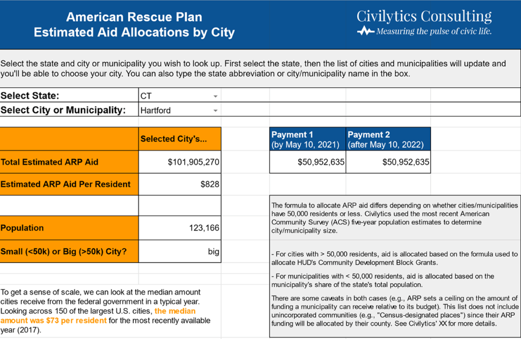
Our most popular data “dashboard” this year is actually a Google Sheet reporting the ARPA aid allocations for every city, town, and county in the U.S. We chose Google Sheets because it was familiar to our intended audience of community activists, it can be easily exported, and we were able to build and style it relatively quickly. Keeping it up to date was a downside, but fortunately we only had to update it 3 times before the Treasury finalized their numbers.
Finding new roles for Shiny dashboards
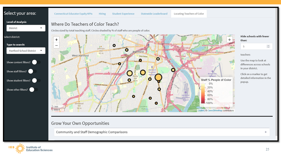
Our tool analyzing local governments’ spending on social services and policing is available as a Shiny app embedded on a WordPress site, which allows users to engage with the dashboard from within the context of a site they trust. We worked with journalists at the Milwaukee Journal Sentinel to publish two interactive Shiny applications to communicate the scale and scope of prison gerrymandering in communities across Wisconsin. We also used a Shiny dashboard to build an interactive prototype for our partnership project with REL Northeast and Islands focused on educator diversity in Connecticut. In this case the Shiny dashboard was helpful to make a rapid prototyping environment to quickly gather stakeholder feedback before building out design requirements in the more robust, but less nimble enterprise dashboard.
Statistical tools we’ve built or are building
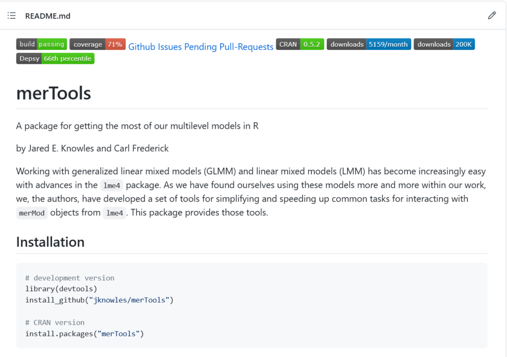
By far the most popular thing I’ve ever written is a guide on how to fit and evaluate multilevel models in R. If you’re interested in mixed models in R, check it out. I co-developed and maintain a popular R package (merTools) that makes it easier to work with multilevel models. It’s the only non-MCMC way to get prediction intervals out of generalized linear multilevel models and the fastest way to get intervals for really big models. It’s increasingly hard to find the time to maintain and improve merTools (see the pending pull requests on GitHub), so if you know of a way I could find financial support to give the package some care and feeding, let me know!
If you’re looking to build your fluency with multilevel models and Bayesian estimation, I highly recommend Statistical Rethinking by Richard McElreath and Michael Clark’s excellent guide on multilevel estimation for Bayesian shrinkage (to account for small sample sizes). I used both as guides while working on new ways to generate credible intervals for rare event rates (like arrests in schools) and to make appropriate comparisons among subgroups of very different sizes. We’re still in the exploration phase of this work but I think it’s a promising approach to overcome some of the statistical challenges in equity analyses.
Another statistical tool we’re developing is streamlined geospatial joins and spatial interpolation to accurately combine data at different geographies. I learned more about the tools for doing this from participating on the advisory board of the Python geosnap project. We put these tools to work to provide a first-ever look at the impact of prison gerrymandering on state legislatures in all 50 states, which required us to make multiple complex spatial joins at different aggregations as described in our blog post.
Tools we are learning about or in search of
Doing public data analysis requires lots of behind-the-scenes data preparation, and it’s still far too easy to make mistakes and far too hard to seamlessly document. But, we’re trying to get more deliberate, transparent, and accurate with our analysis and communication every day.
Together we did a good job of leaning into the beginner mindset, trying our hand at new skills, and sharpening existing ones.
Hannah watched and re-watched and watched again several R instructional videos I’ve recorded for various clients. Learning new tools is hard. It turns out some of those jokes in my instructional videos hold up to a rewatch though 🙂 And she took a class on JavaScript and CSS offered by a volunteer at our local library.
On top of that, we’re still learning more about:
- Python (django and geospatial interpolation)
- PowerBI and Tableau
- Javascript
- PostGIS and spatial databases
- And one of us is still slowly learning R…
We still have quite a few unknowns in the lab where I haven’t found the right tool to support our work. I’d love to hear if you have any recommendations or suggestions on how we could solve the following problems with self-hosted or open source software:
- Digital Asset Management for a searchable database for managing our graphics, slides, videos, and other content (and an affordable stock photo marketplace)
- Data management to make our data archives searchable with metadata and even able to be queried and explored
- A good solution for self-hosting Shiny applications and API endpoints
Keep in mind one of us is probably too early of an adopter and the other is a reluctant one 😉 But we both welcome your recommendations, just hit reply and let us know!
Our next issue will be a review of our projects this year, a selection of our highlights, and a bit more about what you can expect from Civilytics and The Civic Pulse next year.
As always, we appreciate your help spreading the word about this newsletter. If you haven’t already, please subscribe. If you subscribe, send it to a friend, or share it on social media.
With gratitude,
Jared