
Update 1: Package is now available on CRAN.
Update 2: Development version also supports models from the blme package.
By far the most popular content on this blog are my two tutorials on how to fit and use multilevel models in R. Since publishing those tutorials I have received numerous questions, comments, and hits to this blog looking for more information about multilevel models in R. Since my day job involves fitting and exploring multilevel models, as well as explaining them to a non-technical audience, I began working with my colleague Carl Frederick on an R package to make these tasks easier. Today, I’m happy to announce that our solution, merTools, is now available. Below, I reproduce the package README file, but you can find out more on GitHub. There are two extensive vignettes that describe how to make use of the package, as well as a shiny app that allows interactive model exploration. The package should be available on CRAN within the next few days.
Working with generalized linear mixed models (GLMM) and linear mixed models (LMM) has become increasingly easy with advances in the lme4 package. As we have found ourselves using these models more and more within our work, we, the authors, have developed a set of tools for simplifying and speeding up common tasks for interacting with merMod objects from lme4. This package provides those tools.
Installation
# development version
library(devtools)
install_github("jknowles/merTools")

# CRAN version -- coming soon
install.packages("merTools")
Shiny App and Demo
The easiest way to demo the features of this application is to use the bundled Shiny application which launches a number of the metrics here to aide in exploring the model. To do this:
devtools::install_github("jknowles/merTools")
library(merTools)
m1 <- lmer(y ~ service + lectage + studage + (1|d) + (1|s), data=InstEval)
shinyMer(m1, simData = InstEval[1:100, ]) # just try the first 100 rows of data
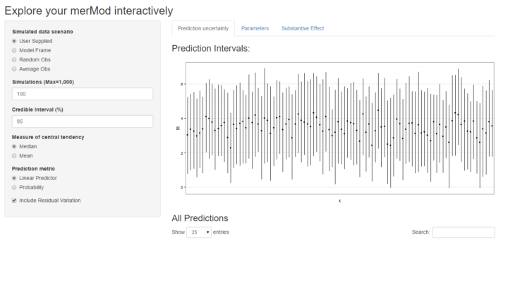
On the first tab, the function presents the prediction intervals for the data selected by user which are calculated using the predictInterval function within the package. This function calculates prediction intervals quickly by sampling from the simulated distribution of the fixed effect and random effect terms and combining these simulated estimates to produce a distribution of predictions for each observation. This allows prediction intervals to be generated from very large models where the use of bootMer would not be feasible computationally.
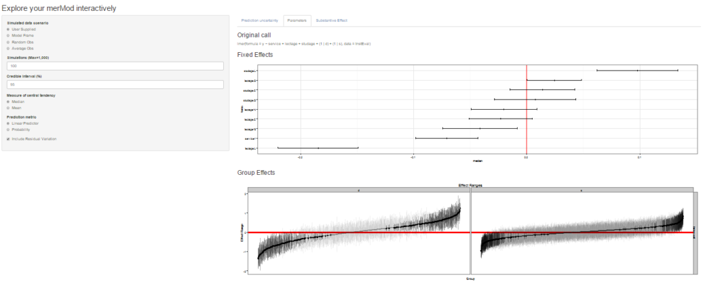
On the next tab the distribution of the fixed effect and group-level effects is depicted on confidence interval plots. These are useful for diagnostics and provide a way to inspect the relative magnitudes of various parameters. This tab makes use of four related functions in merTools: FEsim, plotFEsim, REsim and plotREsim which are available to be used on their own as well.
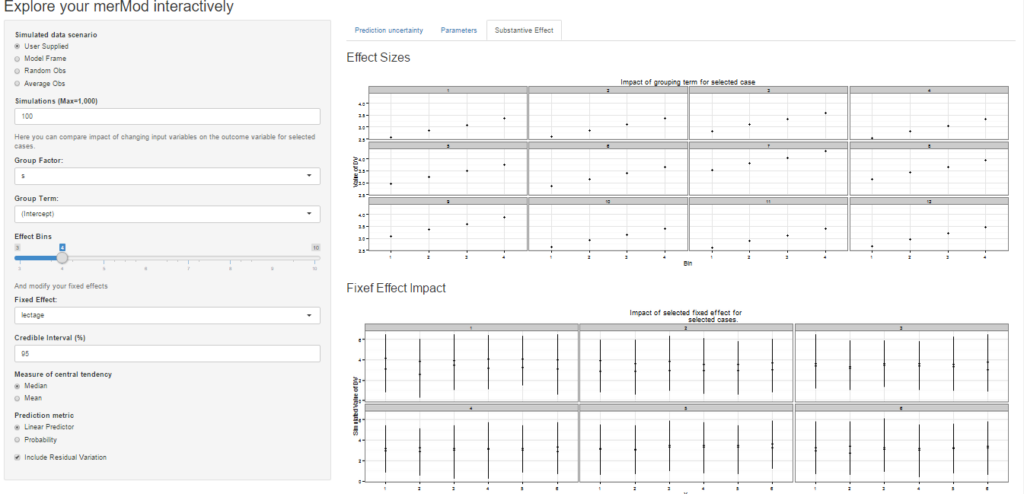
On the third tab are some convenient ways to show the influence or magnitude of effects by leveraging the power of predictInterval. For each case, up to 12, in the selected data type, the user can view the impact of changing either one of the fixed effect or one of the grouping level terms. Using the REimpact function, each case is simulated with the model’s prediction if all else was held equal, but the observation was moved through the distribution of the fixed effect or the random effect term. This is plotted on the scale of the dependent variable, which allows the user to compare the magnitude of effects across variables, and also between models on the same data.
Predicting
Standard prediction looks like so.
predict(m1, newdata = InstEval[1:10, ])
#>        1        2        3        4        5        6        7        8
#> 3.146336 3.165211 3.398499 3.114248 3.320686 3.252670 4.180896 3.845218
#>        9       10
#> 3.779336 3.331012
With predictInterval we obtain predictions that are more like the standard objects produced by lm and glm:
#predictInterval(m1, newdata = InstEval[1:10, ]) # all other parameters are optional
predictInterval(m1, newdata = InstEval[1:10, ], n.sims = 500, level = 0.9,
                stat = 'median')
#>         fit      lwr      upr
#> 1  3.074148 1.112255 4.903116
#> 2  3.243587 1.271725 5.200187
#> 3  3.529055 1.409372 5.304214
#> 4  3.072788 1.079944 5.142912
#> 5  3.395598 1.268169 5.327549
#> 6  3.262092 1.333713 5.304931
#> 7  4.215371 2.136654 6.078790
#> 8  3.816399 1.860071 5.769248
#> 9  3.811090 1.697161 5.775237
#> 10 3.337685 1.417322 5.341484
Note that predictInterval is slower because it is computing simulations. It can also return all of the simulated yhat values as an attribute to the predict object itself.
predictInterval uses the sim function from the arm package heavily to draw the distributions of the parameters of the model. It then combines these simulated values to create a distribution of the yhat for each observation.
Plotting
merTools also provides functionality for inspecting merMod objects visually. The easiest are getting the posterior distributions of both fixed and random effect parameters.
feSims <- FEsim(m1, n.sims = 100)
head(feSims)
#>          term        mean      median         sd
#> 1 (Intercept)  3.22673524  3.22793168 0.01798444
#> 2    service1 -0.07331857 -0.07482390 0.01304097
#> 3   lectage.L -0.18419526 -0.18451731 0.01726253
#> 4   lectage.Q  0.02287717  0.02187172 0.01328641
#> 5   lectage.C -0.02282755 -0.02117014 0.01324410
#> 6   lectage^4 -0.01940499 -0.02041036 0.01196718
And we can also plot this:
plotFEsim(FEsim(m1, n.sims = 100), level = 0.9, stat = 'median', intercept = FALSE)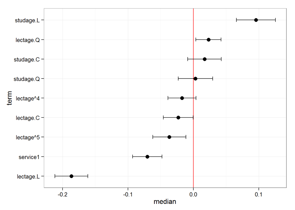
We can also quickly make caterpillar plots for the random-effect terms:
reSims <- REsim(m1, n.sims = 100)
head(reSims)
#>   groupFctr groupID        term        mean      median        sd
#> 1         s       1 (Intercept)  0.15317316  0.11665654 0.3255914
#> 2         s       2 (Intercept) -0.08744824 -0.03964493 0.2940082
#> 3         s       3 (Intercept)  0.29063126  0.30065450 0.2882751
#> 4         s       4 (Intercept)  0.26176515  0.26428522 0.2972536
#> 5         s       5 (Intercept)  0.06069458  0.06518977 0.3105805
#> 6         s       6 (Intercept)  0.08055309  0.05872426 0.2182059
plotREsim(REsim(m1, n.sims = 100), stat = 'median', sd = TRUE)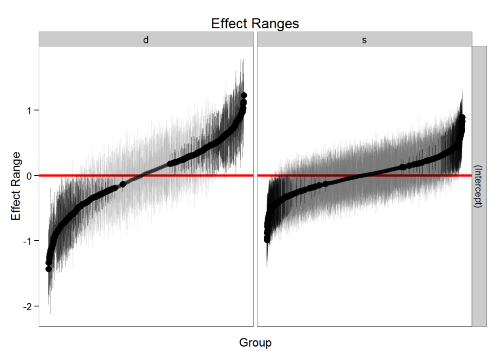
Note that plotREsim highlights group levels that have a simulated distribution that does not overlap 0 – these appear darker. The lighter bars represent grouping levels that are not distinguishable from 0 in the data.
Sometimes the random effects can be hard to interpret and not all of them are meaningfully different from zero. To help with this merTools provides the expectedRank function, which provides the percentile ranks for the observed groups in the random effect distribution taking into account both the magnitude and uncertainty of the estimated effect for each group.
ranks <- expectedRank(m1, groupFctr = "d")
head(ranks)
#>      d (Intercept) (Intercept)_var       ER pctER
#> 1 1866   1.2553613     0.012755634 1123.806   100
#> 2 1258   1.1674852     0.034291228 1115.766    99
#> 3  240   1.0933372     0.008761218 1115.090    99
#> 4   79   1.0998653     0.023095979 1112.315    99
#> 5  676   1.0169070     0.026562174 1101.553    98
#> 6   66   0.9568607     0.008602823 1098.049    97
Effect Simulation
It can still be difficult to interpret the results of LMM and GLMM models, especially the relative influence of varying parameters on the predicted outcome. This is where the REimpact and the wiggle functions in merTools can be handy.
impSim <- REimpact(m1, InstEval[7, ], groupFctr = "d", breaks = 5,
                   n.sims = 300, level = 0.9)
impSim
#>   case bin   AvgFit     AvgFitSE nobs
#> 1    1   1 2.787033 2.801368e-04  193
#> 2    1   2 3.260565 5.389196e-05  240
#> 3    1   3 3.561137 5.976653e-05  254
#> 4    1   4 3.840941 6.266748e-05  265
#> 5    1   5 4.235376 1.881360e-04  176
The result of REimpact shows the change in the yhat as the case we supplied to newdata is moved from the first to the fifth quintile in terms of the magnitude of the group factor coefficient. We can see here that the individual professor effect has a strong impact on the outcome variable. This can be shown graphically as well:
library(ggplot2)
ggplot(impSim, aes(x = factor(bin), y = AvgFit, ymin = AvgFit - 1.96*AvgFitSE,
                   ymax = AvgFit + 1.96*AvgFitSE)) +
  geom_pointrange() + theme_bw() + labs(x = "Bin of `d` term", y = "Predicted Fit")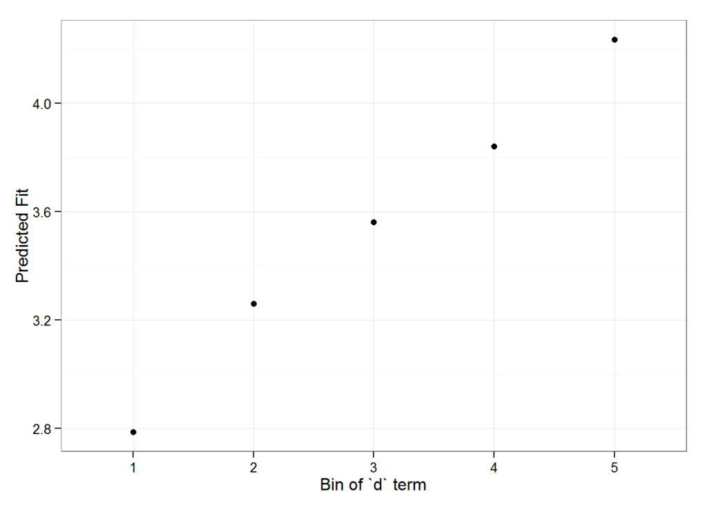
Here the standard error is a bit different – it is the weighted standard error of the mean effect within the bin. It does not take into account the variability within the effects of each observation in the bin – accounting for this variation will be a future addition to merTools.