Understanding Through Comparison
Have you ever wondered how many police officers are employed in your community? Have you ever wondered what those officers are spending their time doing? Or, maybe you are a police officer and you wonder if your experience would be different if you worked in a different town. Maybe you wonder how different policing in your community is now than it was fifteen or twenty years ago. What has changed? What’s stayed the same?
Fact Sheets on Over 250 Law Enforcement Agencies
Civilytics’ Police Fact Sheet provides an overview of policing data for each of more than 200 cities and 70 counties nationwide. Each fact sheet includes:
- An executive summary reviewing the data points that stand out the most for that community
- An analysis of the size of police departments in a community — including suburban and nearby police departments
- A comparison of the arrest behavior of the largest police department in the community to all of its neighbors, broken out by the offense leading to the arrest
- A focus on disproportionality in arrest rates between black and white individuals
- A look at long-term trends in who is arrested, including trends for adults and juveniles as well as black and white individuals
The fact sheets use the most recent comprehensive national data on police departments, the FBI’s Uniform Crime Report (UCR). We have an overview of the strengths and weaknesses of this data source on our blog. When the FBI releases updated arrest data from 2017 and 2018, the fact sheets will be updated.
Join the Conversation about Measuring Policing
Creating measures of performance for any government service is hard. On our blog we’ve covered the challenges of data availability. We’ve reviewed lessons from education performance measurement that should be applied to policing. We’ve talked about the issues of legitimacy and inclusiveness in creating performance measures for the public. And, we’ve looked at why local performance measures are so important to reviving our democracy.
All of that is to say — these fact sheets are a first step. They provide communities with useful high-level information to set expectations and motivate further conversation. And, they have been used that way already to help inform deliberation about policing:
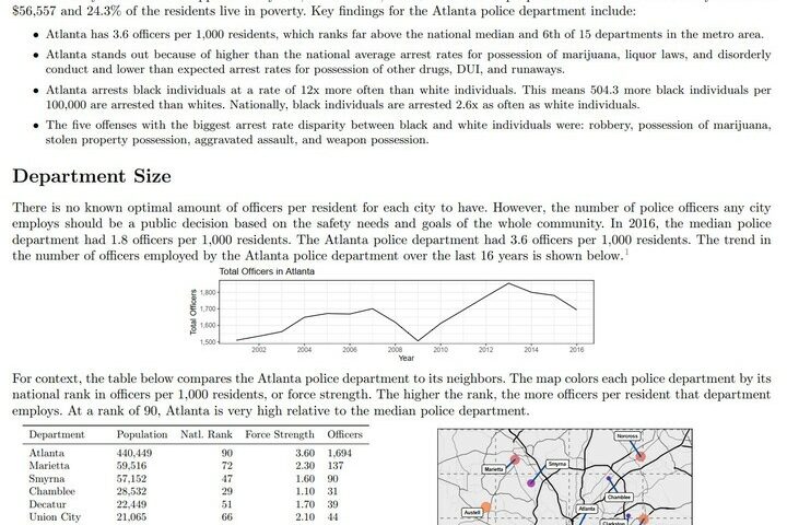
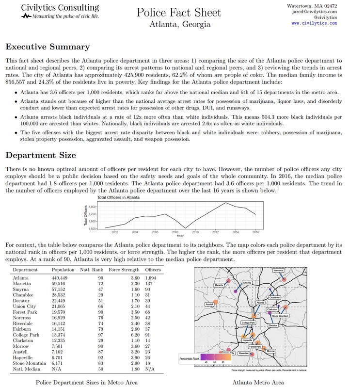
- In Atlanta, community members used the fact sheet to put the size of the police force in context during city budget discussions
- In Columbus, the fact sheet gave additional evidence in support of community members’ concerns about how the department spent resources on arrests
- A fact sheet on Prince George’s County in Maryland gave community members an overview of all the law enforcement agencies in the area
Fact Sheet Examples
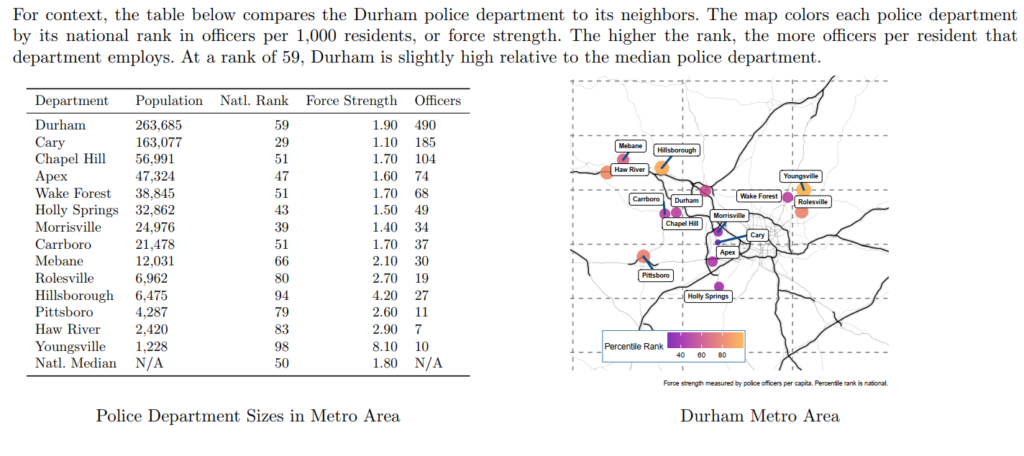
Law Enforcement Agencies by Officers per Capita in Durham, NC
One of the hardest aspects of law enforcement to understand is the number of unique law enforcement agencies operating in a metro area and the varying sizes of those agencies. The fact sheets list all of the metropolitan police forces operating in a community and the number of officers they employ. Here is an example from Durham, NC:
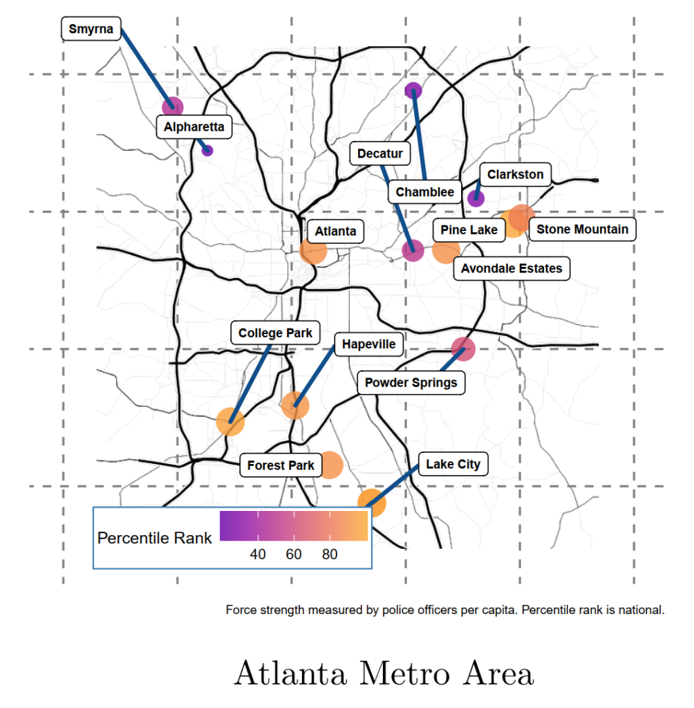
Law Enforcement Agencies by Officers per Capita in Metro Atlanta
Community members can add their own context to police department size data when it is placed on a map of the metropolitan area. A map allows people to imagine the police jurisdictions they pass through as they go about their lives – buying groceries, commuting to work, going home from school. This example from Atlanta shows large regional differences across the metro area.
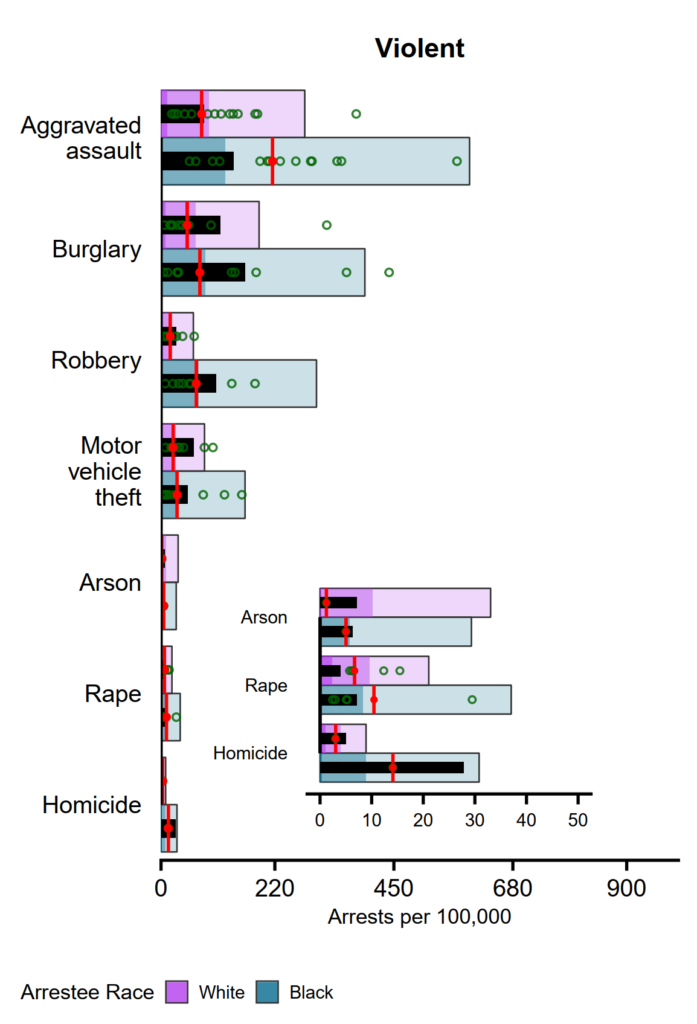
Violent Crime Arrest Rates in and around Mobile, AL
The fact sheet uses bullet charts to give an overview of the arrest rates for various offenses across an entire metro area. Bullet charts are included to pack a lot of dense opportunities for comparison into a small amount of space. For users interested in digging into the data, they provide many possible frames of reference to understand arrest rates. For those who do not want to study a chart, the major conclusions from each chart are listed in both the Executive Summary and text above the chart.
An interpretation guide is given alongside the bullet chart:
This chart compares the arrest rates by race and offense type in Mobile, AL to national and regional averages. The black bar shows the arrest rate for Cedar Rapids. The longer light colored bar shows the 95\(^{th}\) percentile of arrest rates nationally for that offense for each racial group. The darker shaded bar inside it shows the median national arrest rate. For comparison, the bright red segment on the bar shows the expected arrest rate for Cedar Rapids if its arrests for that crime followed the average of its neighbors. Finally, each neighboring police department is shown as a green circle. An inset is provided for detail on the rarest violent crime categories.
Get Your Factsheet Today
We are working to make all the fact sheets publicly available and easy to find. In the meantime, if you would like a fact sheet for your city, town, or county — let us know where you’re located using our contact form. We’ll work on sending you one right away.
And, if you use our fact sheet, we are committed to collaboration and would love feedback on how we can improve this tool for use by people like you.